Click to view our Accessibility Statement or contact us with accessibility-related questions


PRODUCTS YOU MAY LIKE
Trending Posts in Audiophile

Simthaniel
Rigs
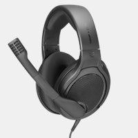
Modded headphones with qudelix at the core
When I received the Qudelix 5K, I had already modified a pair of Superlux HD-681 headphones. I previously soldered my own balanced connections to the drivers, providing multiple ways to connect and...
Apr 14, 2024

brothamike
A decent set of IEMs
I am in the midst of a 300 hour burn-in but, I will say I am enjoying how this set sounds so far. Before I received these which was btw late by a few weeks, I purchased a Sony/Kimber Kable MMCX...
Apr 12, 2024
merrick97
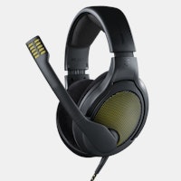
Should I exchange the PC38X for better headphones?
I bought the PC38X headphones FOR GAMING and they are great, but I have NO use for a Microphone since I don't do competitive gaming and I was wondering if there were better headphone options at a similar price without a headphone, where (presumably) more of the cost was put into making it sound better. I also find that my PC38X don't get quite as loud as I would like and I was wondering if a cheap amp like the iFi Go link would draw a little more volume out of my phones. https://www.amazon.com/dp/B0BN6MM822?psc=1&ref=ppx_yo2ov_dt_b_product_details I went with the PC38X since it was considered the best bang for buck headphones. I care most about using spatial apps like DOlby Atmos and DTS Headphone:X. Suggestions are welcome.
Apr 11, 2024
LostnAmerica
Sound Signature of the Grell Project.
Wondering what type of sound signature the Drop Grell project headphones will have or trying to attain. Any update would be appreciated.
Apr 8, 2024
Fabulous
Looking for a gaming/content audio setup
Hello! I'm looking for recommendations on audio setups. I'd be planning on using it mostly for gaming. Preferably I'd like a pair of large closed back headphones since I have a big head and jaw. I'd also like to hear myself through my mic with mic monitoring. As far as budget goes, I don't really have one. But under 600$ would be nice. I can go higher if needed. The audio setup would be connected to a high performance PC. Thank you in advance for any recommendations!
Apr 4, 2024
1plsd
$10 Drop Coupon Email not sent?
Trying to buy some gear off Drop for the first time. I was told I would receive an email with a welcome to drop $10 off promo. I never received that email. Drop was able to send me emails for my login token and email for Password update. But for some reason the $10 off coupon was never sent to me.
Mar 31, 2024
NMPacella
New here
Hello, I just joined, primarily for the audiophile products. Looking at purchasing the NHT C3 speakers for our new living room. Space is about 15 feet wide by 33 long and they will fire long ways. Space is just for general listening, music room with all equipment is downstairs, so hoping they will fill it with sound nicely. Cheers.
Mar 18, 2024
Drop Refurbished
Like-new products you can trustDrop Rewards
Get $5 for every 500 points you earn! Learn more
Drop Keyboard Club
Become a member and expand your keycap collectionCollaborate With Us
For Brands & DesignersFollow Drop
Either way, I seriously doubt you can notice the difference. I did a test once and I I don't think I could pick up a difference until 3dB and that was at a single tone and just noticeable. If a single frequency was off by 3dB in a song I doubt I would notice.
Personally at this price I think your getting a good deal. My advice unless there is an obvious problem, just listen and enjoy.
I personally interpreted it with the "other speaker" always being the 0dB line. So when we're looking at speaker A (the blue line), speaker B is implicitly the flat 0dB line. Whereas when we're looking at speaker B (the orange line), speaker A is implicitly the flat 0dB line. It's almost like two separate graphs overlaid on top of one another.
Regardless, the LSR30X really are a yummy sounding pair of powered monitors, especially when setup properly. Yes, there's a slight amount of "white noise" that I can hear up to a meter or two away when nothing is playing. In my case, the amount of hiss is the same for all settings of the input trim except for "0" (all of the way down) where it goes away completely with a faint "tick". They benefit from a little room gain, so placing them one to two feet from the rear or side walls and having your head < 3ft from the wall behind you will help to fill out the bass. The highs are not harsh or fatiguing. Off axis response sounds like it is well behaved (as you'd expect from JBL).
Many thanks to Massdrop for setting up this drop and then offering us such a great price. Even at the original price, the LSR30X offer excellent value for money, but I'm glad I caught them at this price and didn't have to wait too long for them to arrive. Cheers and happy listening!
I agree that something was lost in the semantics, but that's the only way that graph makes sense. They printed the difference signal as compared to the other speaker twice (making speaker A and then speaker B arbitrarily completely flat) rather than once. Probably an assembly line guy assigned the fun task of running the graph, not a speaker engineer.