Click to view our Accessibility Statement or contact us with accessibility-related questions


PRODUCTS YOU MAY LIKE


Trending Posts in Mechanical Keyboards

ThereminGoatMK
Do I Need to Lube My Keyboard Switches?
Figure 1: Sometime around here is a good time to ask that question... If you’re new to the mechanical keyboard hobby, I have no doubt that planning your first keyboard build is a bit of a daunting task. To be entirely honest with you, it’s only a tiny bit less daunting for your second or even third keyboard builds should you stay around a little while longer. You’ve got the keyboard itself to worry about, stabilizers, keycaps, and even switches on top of all of the intangible marks you want your dream keyboard to hit. Switches are especially daunting right out of the gate as there’s just so many options out there to pick from – each with their own unique specifications, manufacturers, and more. Yet, in spite of all of these differences between switches, time and time again I find people always asking about lubing switches as one of their chief concerns when it comes to picking some up. With countless numbers of content creators talking about lubing switches, its no...
Apr 17, 2024


TiKiToPia
Keyboard & Drink
Playful set
This set goes better for keyboards meant for personal-casual setups as opposed to office-work environments.
Apr 14, 2024
Keyboy
help Momoka zoo 65
What is the diameter and length of the screws for the momoka zoo 65
Apr 14, 2024
jtgas23
ALT V2 not detected with Drop Keyboard Configurator
Hi, This is my first non-mac keyboard. I was under the impression that this would work out of box with with mac desktop however I am having issues getting the ALT V2 detected with the keyboard configurator software. The keyboard is plugged in and powered on. Apologies if this is very basic or if I have used incorrect language describing my issue, I don't have experience with this. Thank you
Apr 13, 2024

HoffmanMyster
From Art to Artisan
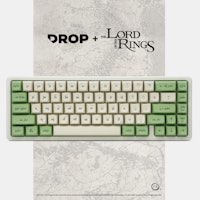
Before launching any product, there are many designs, concepts, and ideas that pass between teams before arriving at a final design which makes its way to your computer screen and, eventually, desk. This is no more true than when considering possibly the most "art"-forward aspect of the mechanical keyboard hobby—artisan keycaps. It should be obvious that a lot of planning and artistry goes into crafting these literal pieces of art. We don't often get a chance to see behind the curtain, though. So, let's take a closer look at the upcoming Drop + Dwarf Factory Lord of the Rings Rohan Artisan Keycaps. Before any resin is spilled, Middle Earth (the entity that licenses the Lord of the Rings IP) needs to approve the concepts based on concept art provided by Dwarf Factory. We connect with DF to coordinate on the topic and subject matter—in this particular case, additional Rohan-themed designs—to be sure that the concepts match with overall direction, whether that be pairing up with a...
Apr 10, 2024
Ikarianpc
My Kingdom for Smooth ABS SA Keycaps
Every time I build a new keyboard, I go hunting for keycaps. And every time I go hunting, it eventually devolves into a desperate search for SA (or equivalent) profile keycaps with a smooth finish. SA is the ultimate profile, IMHO, and they're relatively hard to come by. Signature Plastics, which is where a lot of SA sets come from like the T0mb3ry SA Carbon set (they might actually hold the trademark on the SA profile if I'm not mistaken), is reportedly going through some management/ownership struggles (last I heard, they're looking for new ownership), and along with apparently the rest of the industry, they seem to be neglecting this superior keycap profile in their own stocks. If you order direct from them, they have a couple themed sets in stock (maybe), but generally you can have any color you want, as long as it's black or white. Drop carries a fair number of MT3 profile sets, which are very similar to SA. But just like SP's SA-P profile, they're made with a different...
Apr 10, 2024
Drop Refurbished
Like-new products you can trustDrop Rewards
Get $5 for every 500 points you earn! Learn more
Drop Keyboard Club
Become a member and expand your keycap collectionCollaborate With Us
For Brands & DesignersFollow Drop
The home and QWERTY rows (not sure how to count rows on this profile; rows 3 and 4?) have really deep dishing, more than any keyboard I've used since the Commodore 64 -- its spherical profile is frankly my touchstone (although literally their switch mechanism was terrible) since I learned to type on it. But those two rows are noticeably deeper than the other rows, which begs the question of consistency. It feels like those rows are all homing-dished... It's distracting now but hopefully that distraction would go away with use, so I'll have to wait and see, but since the other rows are less dished I'm pretty sure it's always going to be an issue.
The feel of the plastic itself is top notch, velvety textured, and the keys arrived spotless and without a scratch, foam-protected or individually bagged (!) and the profile (while problematic for some non-standard key layouts) is amazing and pairs well with a modest slant to the keyboard. I initially put them on an XD75 with a 5 or 6 degree slant and it's perfect. I like that the FN key row is still sculpted, and also I hate it because I can't use any of that row custom keys I ordered yet! I'll need to get a TKL or something...
The sets have enough alternates to do some odd boards like XD75 and Planck but not necessarily the keys you want in the profile row you want. You may also find the dishing a bit hard on the thumbs for the 2U or 1U spacebars; I had two alpha kits and used the extra ZXCVB-row 1U blanks that are included in that set, mounted upside down, to let my thumbs more naturally rest; they are really good for this application! I was kind of surprised that nothing I ordered (alphas, mods, ortho, extra mods, and novelties) included a home-row CTRL key at 1U or any 1U BS... but I think people have already discussed the ortho set limitations. Anyway, there was considerably variety available though having way more "END" keys than "HOME" made me scratch my head a bit until I realized some layouts stick other keys between them vertically. BTW, I didn't even try to order this set for Ergodox since when I ordered the large blanks weren't part of the drop and by the time I noticed they were added it had ended. I would have ended up with about as many extra kits and as many keys I'm not able to use. I have a LOT of END keys btw.
Here's a real bummer: the printing, while consistent in tone and durability, is otherwise... subpar. Many of the legends are slightly off center, many moved slightly to the right. The fuzziness of the legends is a bit more noticeable than in other sets I have and makes the number+symbol keys look out of character with the rest. Even the /dev/tty novelty key is muddy and hard to read. My W and K keys are just slightly rotated from level and some keys have slightly lower baselines. Whatever printing system was used was not registering the key locations well enough. It's a tragedy because otherwise they are just amazing, and I hope the next drop will be able to rectify this.
The Extras set has a really nice orange WASD/arrows accent that reminds me of orange sherbet, and I kind of wish I had more of that (but then this isn't Carbon!). The dark blue used for the /dev/tty novelty branding key is too dark for the black legends but a nice blue. Ortho kit's RSE and LWR come in both the grey and orange/light blue that Plancks like, in a flat profile designed to be used on the spacebar row. Again I find the spacebar row slightly uncomfortable to hit with my thumb, but your milage may vary.