Click to view our Accessibility Statement or contact us with accessibility-related questions


Showing 1 of 168 conversations about:

linneverstops
160
Nov 15, 2018
bookmark_border
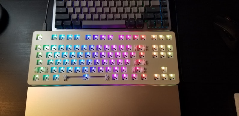
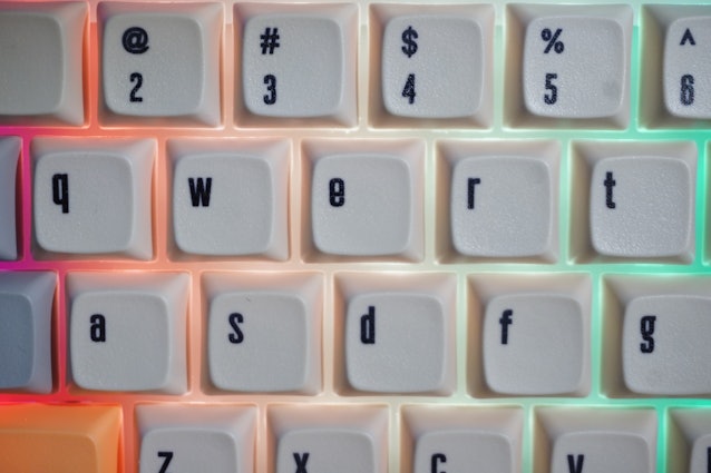
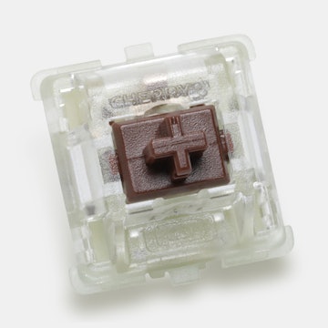
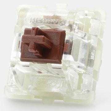
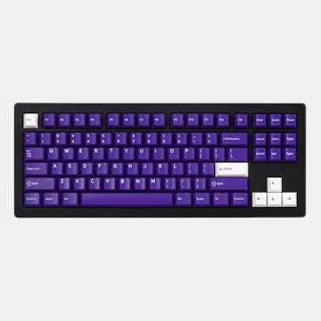
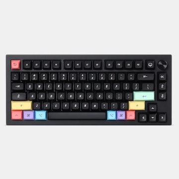
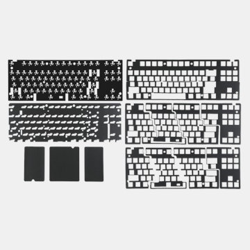
Got mine this morning and she is a beaut! Too bad I have to wait for my switches to come in... The finish is so smooth and looks like the led works this time! 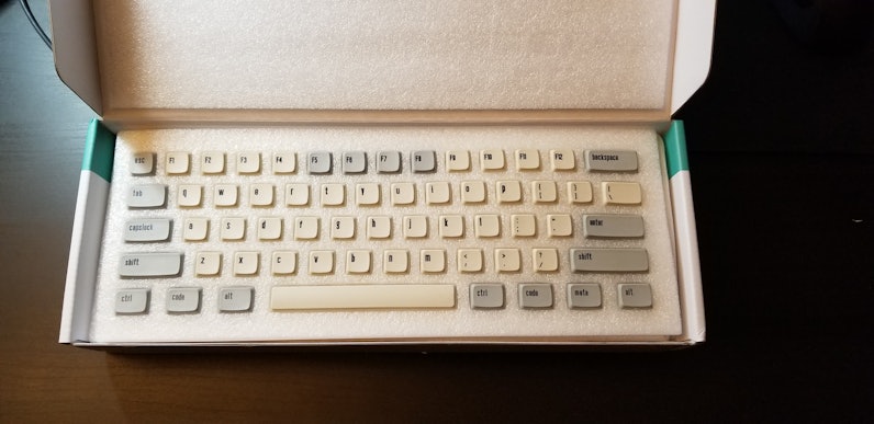
erickong
7412
Mech Keys Moderator
Nov 15, 2018
bookmark_border
linneverstopsThat's some quality packaging
A community member
Nov 15, 2018
bookmark_border
I see. It's good to know that something was (((very slightly))) different than advertised.
But so long as their font choice is consistent across all keycaps, that doesn't sound like anything close to a dealbreaker
Oatmaster
9
Nov 16, 2018
bookmark_border
linneverstopsMan I’m so jealous, my delivery time was changed to Saturday, I’m dying to get it.
YanboWu
8490
Collaborations
Nov 17, 2018
bookmark_border
linneverstopsI'm glad you are enjoying your keyboard. Your photos are great!
One thing to not though. The photos of the keycaps look a little strange. Let me investigate and I'll get back to everyone here.
linneverstops
160
Nov 17, 2018
bookmark_border
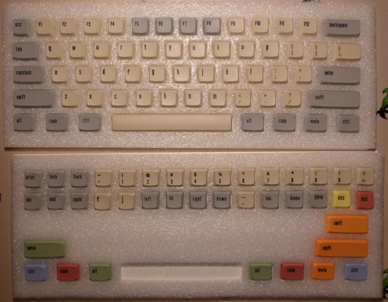
@jasdfhg You know what, upon inspecting, the font did look weird. Some of the letters are more bold than others and some were "higher". Causing a very inconsistent look, here are some more photos of the said issue. 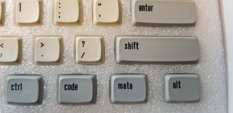
Oatmaster
9
Nov 17, 2018
bookmark_border
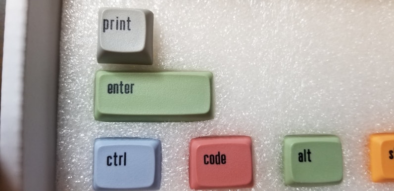
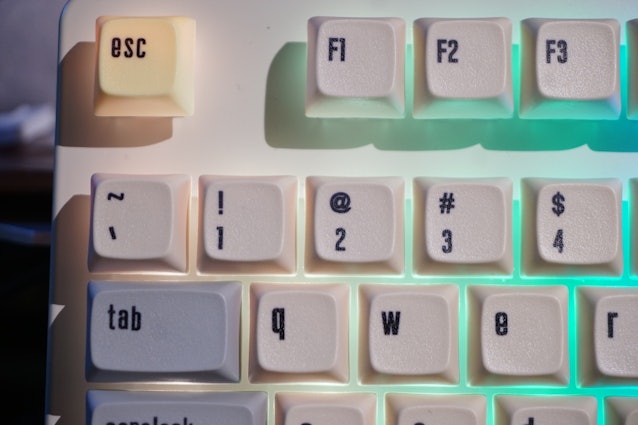
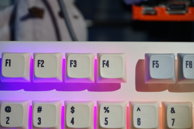
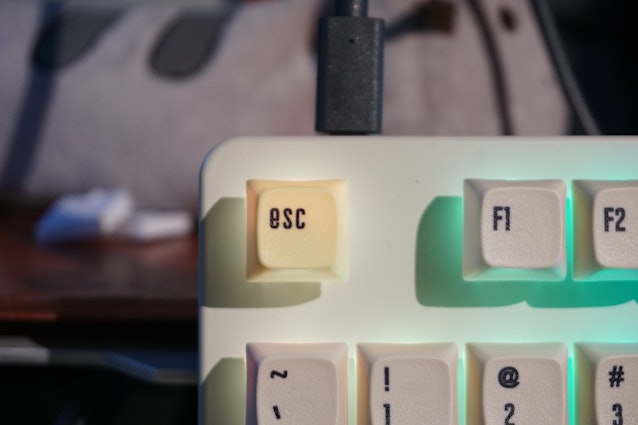
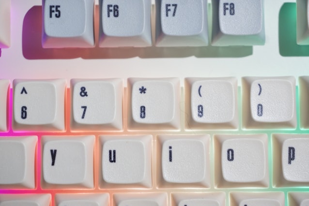
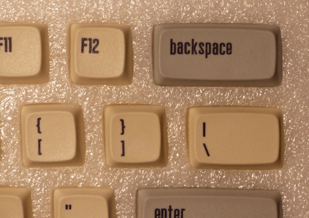
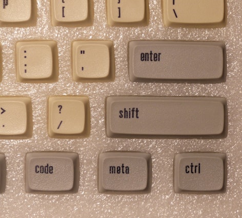
linneverstopsThe different boldness of the font on the key caps is noticeable. I really love love love the ascetics of the caps so I don’t really want to say anything but It really seems the majority of the caps have a significantly thicker line to them than in the original photos. I know the photos are not exact representing of the final product as things change in production but it really does seem to be a much thicker line. For example the @ sign is almost one solid mass with no breathing room. And the counters (little wholes in the letters) in a lot of the letters are kinda swallowed up by the added thickness. For example the e key is very effected, as well as the 4 f4 8 and f8. And the @ symbol is extremely bold. Interesting thing though is that the esc key has a perfectly fine e when compared to the e key. This difference in size is most notable in the comparison between the m key and the < key as they are right next to each other. The m key is significant thicker than the < key. I’m not sure what to think as I really love this set of caps but it’s not exactly consistent on thickness.

linneverstops
160
Nov 17, 2018
bookmark_border
OatmasterYes, I have noticed the hyper-thickness in the number 4 and @ as well. I don't know what to think as well...
MiTo
13955
MiTo
Nov 17, 2018
bookmark_border
OatmasterLike @YanboWu said, Massdrop is investigating a possible issue with the keycaps. Not clear yet if everyone’s kits are affected or just a few out of the ordered batch.
The manufacturer must keep the consistency for everyone of course, as all the keycaps should look exactly like seen on the drop page with clearly defined thin looking elegant characters. That’s what I designed and sampled, that’s what the supporters expect to receive and that’s what Massdrop purchased for everyone who participated so we are investigating. Customer Support doesn’t work on weekends though, so we must stand by.
One thing it is for sure, it’s not a design issue, it’s a manufacturing consistency issue. The situation got me scratching my head because I don’t understand how they managed to print keycaps looking like this, not even a bad sample batch ever looked like this.
@linneverstops pictures were very helpful and I can already see from his pictures that his keycaps are messed up and nowhere near what they should look like. @Oatmaster pictures as well. Characters are offset, thick, ugly.
I am sure it’s a consistency issue but I hope only a couple kits were affected. If the manufacturer delivered us perfect samples and perfect kits, then everyone’s kits should and ultimately will look like that.
Again, @YanboWu and Massdrop are figuring this so everyone will receive perfect keycaps, I’m sure they will do whatever is necessary so don’t worry. You warned us and we are aware and working on it.
Thank you very much for the pictures and I hope you are enjoying the keyboards! Let’s stand by for an update on keycaps.
linneverstops
160
Nov 17, 2018
bookmark_border
MiToPlease don't take me wrong from the above comments but I absolutely love your design MiTo and I jumped on this drop when I saw it. I do appreciate very much the response and investigation!
MiTo
13955
MiTo
Nov 17, 2018
bookmark_border
linneverstopsFar from that chief, again thank you so much for the detailed pictures and comments... Without all forms of criticism there’s no improvement and I am and always will be on the lookout, open to hear the community and perfect these products. That’s the ultimate mission of my hobby.
Projects like this wouldn’t exist without the support of the community and people like you, so thanks a lot for putting faith in the ideas and designs. It’s a shame that apparently there’s something wrong but I’m sure there is a solution. Again thank you very much for your support and enthusiasm, I appreciate you a lot!
A community member
Nov 17, 2018
bookmark_border
MiToHi, my package just arrived.
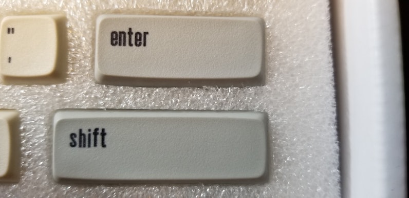
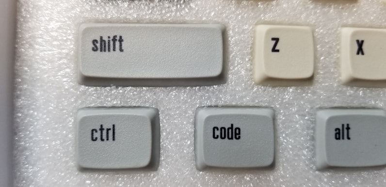
My keycaps appear to have the same weird inconsistencies as those of @linneverstops and @Oatmaster, meaning some things are bold, some are not, some are printed slightly higher and some a bit lower.
Example for inconsistency in the baseline:
MiTo
13955
MiTo
Nov 17, 2018
bookmark_border
@Oatmaster - Indeed, I can clearly see what you mean. Those are incredibly bad and unacceptable. Let’s wait for the conclusion of the investigation by @YanboWu so we can proceed with replacements. Thanks a lot for the detailed message and the support and patience, of course!
EDIT: Word is that people affected with those weird legends should go ahead and open a ticket with pictures (it can be phone pictures, no problem) describing the issues so replacements can get delivered.

A community member
Jan 4, 2019
bookmark_border
TeeAreEffedUpyes, and it was really simple.
Go to Transactions and select "contact support" on your order.
Explain the issue, link this thread and attach your own pictures.
They then ask you whether you'd like a partial refund, whether you'd like to return the product entirely for a full refund or if they should send you a new set of keycaps.
I went for new keycaps, but they will probably take a while. Mine haven't arrived yet.
Related Products

Drop Refurbished
Like-new products you can trustDrop Rewards
Get $5 for every 500 points you earn! Learn more
Drop Keyboard Club
Become a member and expand your keycap collectionCollaborate With Us
For Brands & DesignersFollow Drop