Click to view our Accessibility Statement or contact us with accessibility-related questions


PRODUCTS YOU MAY LIKE
Trending Posts in Mechanical Keyboards

Robbedoes
*Help* Screw in stabilizers not fitting in Dropshift V2 keyboard
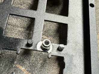
I'm trying to build a mechanical keyboard with screw in stabilizers, I've build some mechanical keyboards with click-in stabilizers, never with screw in. Somehow one of the pins of the metal top-part collides with the screw in stabilizer of the numpad "enter key". I already tried grinding of a bit of the pin that collides with the stabilizer, but unfortunately I can't make it fit/close properly. You can see that the pin of the toppart leaves a mark on the bottompart of the stabilizer, see picture 2. What am I missing? Using Durock V2 in a Dropshift fullsize V2. See pictures below, thanks in advance!
Apr 23, 2024
Fukyachickennuggets
Polymer clay
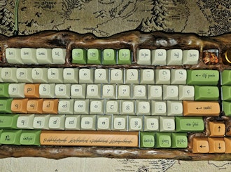
Don't drop crazy cash on custom wood builds! Instead go buy polymer clay and paint. Then you can spend a ridiculous amount of time trying to make it look like you can afford to drop crazy cash on...
Apr 22, 2024
GrEEdYY
HELP PLEASE!
HELP PLEASE! I put noise insulation in the keyboard and after that it stopped working, the only sign of life is 5 blinks of orange light.can do something about it? model:DROP ALTv1
Apr 22, 2024

Durazell
Want to build a Clicky Mech Keyboard. Where to begin?
Hello all. Am brand new to the idea of building my own keyboard. Have not a clue where to begin this process. I am a Sim Game enthusiast. American Truck Sim, DCS Flight Sim and goes from there. Need some real help on where to start for making my own Full Size, Clickey Mechanical KB. I want each key to have its own backlighting. Are there keys that are better than others for this? Is there a great spot on site for a person who has never even taken a keyboard apart? Let alone fixed or built one? I would like it to fit my theme of Red and Black. Yet maybe have the option of changing things up a bit. Any help at all would be greatly appreciated. Thank you all kindly, Durazell
Apr 20, 2024

CaptainYoghurt
Does the ALT v2 PCBA support USB-C e-marked cables?
Currently my ALT v1 does not work with e-marked USB-C cables. I was wondering if the v2 PCBA does support these types of cables (thunderbolt 4 cable for example)?
Apr 20, 2024

AiheyStudio
Favorite Artisans
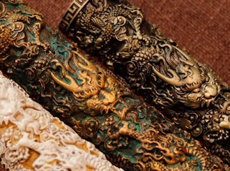
Dragon Pillar Artisan Keycaps Creative Resin Keycaps for 6.25u and 7u Space Bars
Discover the allure of our Dragon Pillar Artisan Keycaps – unique resin keycaps designed to adorn your 6.25u and 7u space bars. Crafted with creativity and precision, each keycap features an...
Apr 18, 2024
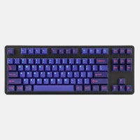
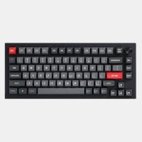
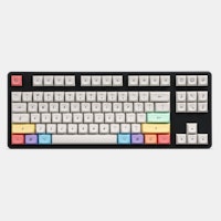
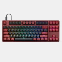
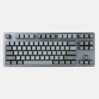
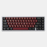
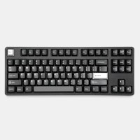
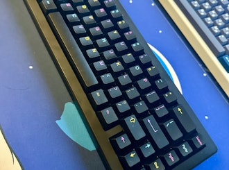

1 - If you like corner legends visuals you should select Alphas + TEXT Modifiers;
2- If you like center legends visuals you should select Betas + ICON Modifiers;
The Alphas kit will be manufactured with the custom typeface inspired by Univers, Mongoose, Kizo, etc.
The Betas kit will be manufactured with the standard XDA dye-sub font.
This is a Betas kit mockup I've put together for representation only, alignment, scale, etc. was not a thing.
Some compromises will have to be made, I can't possibly please everyone and make center text modifiers (or corner icon modifiers) as well because it would triplicate the size of this group buy. I' trying to balance things even as much as I can to make you happy without running away from the initial idea. I added a disclaimer to the bottom of the Betas kit so you can clearly see that it's designed for the ICONS modifiers. The alphas kit we currently have on the drop page is meant to be used with TEXT modifiers.
Are we going in the right direction, with this new option?
This is what the numpad kit looks like now:
Oh and on the subject of XDA, I wonder how they cope with per key LED lighting - they seem thick enough to be completely opaque but that's usually not the case, I think I just need to ditch key LEDs and go exclusively with either none or just underglow at this point.
Center aligned is extremely common, so no point repeating it constantly. Besides every other profile has it which includes all the SA and DSA range made by SP.
This design by MiTo uses all lower case which is far more appropriate since most people communicate online and in reports, with lower case lettering and never with all Upper case lettering (unless you're shouting and screaming at some one).
I've never seen left aligned, lower case lettering before, is what I meant to say ; )