Click to view our Accessibility Statement or contact us with accessibility-related questions


Showing 1 of 478 conversations about:
PhoenixUNI
23
Jul 5, 2017
bookmark_border
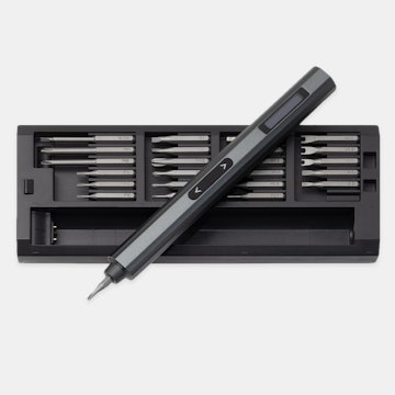
dvorcolColors are off. Also, how do you see the count of things ordered?
dvorcol
5377
Keyboard Club Member
Jul 5, 2017
bookmark_border
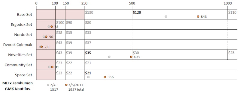
PhoenixUNIThe horizontal "X" axis is the order count to scale.
The price drop points are marked with vertical lines and labeled at the top.
The orange point for each set shows the latest count, and is labeled.
The grey point shows the previous count.
The legend at the bottom shows the dates for the points and total order counts for those dates.
I changed the colors to more closely match the drop data matrix. And I added gridlines for every 50 orders. Does this help?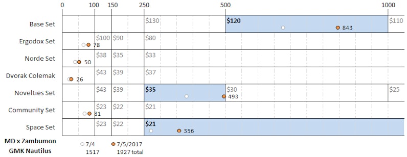
I changed the colors to more closely match the drop data matrix. And I added gridlines for every 50 orders. Does this help?
PhoenixUNI
23
Jul 5, 2017
bookmark_border
dvorcolI was more commenting that you could've used some red on the Base Set 250-500, Novelties 100-250, and Spaces 100-250 ranges.
dvorcol
5377
Keyboard Club Member
Jul 5, 2017
bookmark_border
KonjungamoThanks! Which version do you prefer?
Konjungamo
40
Jul 5, 2017
bookmark_border
dvorcolPersonally, I would keep the gridlines and also keep the red areas for order numbers that are below the MOQ. The blue is a nice addition but not entirely necessary if the dot of the current numbers is highlighted enough.
A label for the x-axis would be helpful though.
A label for the x-axis would be helpful though.
Orac
202
Jul 6, 2017
bookmark_border
dvorcolIt's a nice visualization to track the progress between snapshots :)
The red bullets highlight where we're at so I'm not sure the shaded regions add anything. Maybe you could try shading the entire row, say 10% opacity with 25% in the range the kit reached - but it's still doubling the information already provided so may just look cluttered anyway.
Alternatively, perhaps have the red shading in the below MOQ regions + blue in the MOQ reached regions for all, but again keep the opacity very low so that the bullets are the stand out detail.
The faint grid lines are good.
Related Products


Drop Refurbished
Like-new products you can trustDrop Rewards
Get $5 for every 500 points you earn! Learn more
Drop Keyboard Club
Become a member and expand your keycap collectionCollaborate With Us
For Brands & DesignersFollow Drop