Click to view our Accessibility Statement or contact us with accessibility-related questions


Showing 1 of 5 conversations about:
Tibaldi by Montegrappa Ballpoint & Fountain Pens
dedalian
94
Mar 27, 2018
On the Tibaldi website the blue pens look a lot more blue than the photos here.
http://tibaldi.it/ny-fountain-blue-with-yellow-gold-plating/
Can someone clarify if this is a different item (maybe older model) or if there is just some issue with the photography
Theroc
2318
Keyboard Club Member
Mar 27, 2018
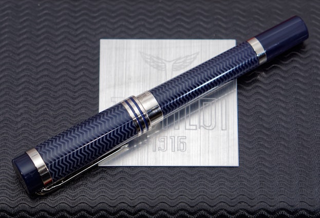
dedalianI own this pen (the blue Rhodium version of the New York) and the blue is more like that on Tibaldi's.
However, if you look at the other photos of the same pen on Tibaldi's you'll see that some of them look more like MD's photos. The etched zigzag seems to throw camera white balance off balance.
Here's a shot of mine
dedalian
94
Mar 28, 2018
TherocThanks for your reply
Drop Refurbished
Like-new products you can trustDrop Rewards
Get $5 for every 500 points you earn! Learn more
Drop Keyboard Club
Become a member and expand your keycap collectionCollaborate With Us
For Brands & DesignersFollow Drop