Click to view our Accessibility Statement or contact us with accessibility-related questions


Pale Night Theme
search
close
Sort by: Newest
keyboard_arrow_down
SifakaMon
310
Apr 30, 2018
This looks like something you could make with SP's <pimpmykeyboard.com> Hana modifiers and a custom DSA alpha field from their generic Gorton DSA.
SifakaMon
310
Apr 30, 2018
SifakaMonWell, except I forgot Gorton is printed thus can't go light, you'd need DSA Dolch I guess, which is not that dark.

lunaticrover
0
Apr 26, 2018
I like the colour selection for the theme but there's too much cursive text for me (import statements, try catch statements etc) maybe I'm not accustomed to such amount of cursive text...
With regard to the font I think it's an extraordinary font for extraordinary price (~180 USD), I don't like the way how it looks like on the screen, too fancy for me.
I am using the following colour theme now: https://draculatheme.com
With regard to the font I think it's an extraordinary font for extraordinary price (~180 USD), I don't like the way how it looks like on the screen, too fancy for me.
I am using the following colour theme now: https://draculatheme.com
raulrincon
17
Apr 27, 2018
If you're serious about design, your clients, the type design's job and more, yes.
You should too.
You should too.
catCollector
83
Apr 26, 2018
You would probably get more traction if you used one of the many web based keyboard color scheme generators and created a sample we can look at.

bboltn
261
Apr 25, 2018
Wolfgang_BachOh yeah, those aren't even screenshots of my editor. It's the same theme though.


Starius
703
Apr 22, 2018
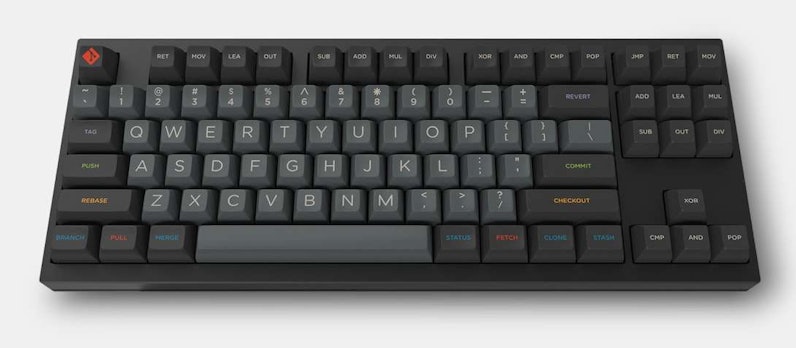
It reminds me a bit of GMK Solarized Dark.
https://www.keyclack.com/groupbuy/gmkSolarizedDarkR1
https://www.keyclack.com/groupbuy/gmkSolarizedDarkR1
Starius
703
Apr 22, 2018
bboltnI'm sorry I missed it too.
And I have a tendency to initially and immediately dismiss a keycap set that has off center alpha key lettering, as I prefer centered letters. But then later on I often say to myself, "Geez, I should have gotten that."
And I have a tendency to initially and immediately dismiss a keycap set that has off center alpha key lettering, as I prefer centered letters. But then later on I often say to myself, "Geez, I should have gotten that."
LevelSteam
Apr 22, 2018
You might like SA/GMK Oblivion. The group buys wrapped up for them a while back but production is wrapping up on the SA sets so you might be able to get one second hand.
PRODUCTS YOU MAY LIKE


Trending Posts in Mechanical Keyboards

lantz
Red Samurai on a 75%
Corsair K65 Plus Wireless GMK Red Samurai Moondrop Tactile Tessence
Apr 19, 2024

Keyled
My PRECIOUS!!!!
All that sweat and money paid off. I will use it wisely. Tokyo 60 GMK Serenity Gateron Oil KIng
Apr 19, 2024

TotallyJaded
How do you do per-key RGB lighting on a Shift V2?
I saw the online configurator that lets you do this on the Shift V1, where it spits out a compiled firmware file to flash. The V2 doesn't seem to have this function in the Windows configurator, though. I can't imagine the answer here is "you're going to have to manually write the hex for every key in QMK, compile it, and flash that".
Apr 18, 2024

AiheyStudio
Favorite Artisans
Dragon Pillar Artisan Keycaps Creative Resin Keycaps for 6.25u and 7u Space Bars
Discover the allure of our Dragon Pillar Artisan Keycaps – unique resin keycaps designed to adorn your 6.25u and 7u space bars. Crafted with creativity and precision, each keycap features an...
Apr 18, 2024


lwthunder
Drop CTRL V2 Mechanical Keyboard PCBA
If I want some hot-swap socket for replacement, where I can buy to ensure it fits this PCBA?
Apr 17, 2024
Drop Refurbished
Like-new products you can trustDrop Rewards
Get $5 for every 500 points you earn! Learn more
Drop Keyboard Club
Become a member and expand your keycap collectionCollaborate With Us
For Brands & DesignersFollow Drop
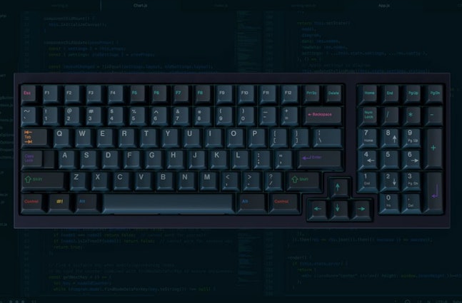
Update: Here's an image I made with kle_render and keyboard layout editor.
https://marketplace.visualstudio.com/items?itemName=whizkydee.material-palenight-theme
https://equinsuocha.io/material-theme/#/palenight