Click to view our Accessibility Statement or contact us with accessibility-related questions


Showing 1 of 1481 conversations about:

MiTo
13956
MiTo
Jan 18, 2017
bookmark_border

MiTo
13956
MiTo
Jan 18, 2017
bookmark_border
ViraYour observation is spot on!
Fn should be >* but I'm keeping this symbol exlusive for Tsangan just so non-standard users have a little something to differentiate their weird layouts. Technically, since >_ can have multiple meanings, the user can pretend that it means hack/code/win and Fn as well! I left this detail on purpose, for people to use their imagination and assemble >_ to whatever they want.
You read the convetion perfectly, so perfectly that you managed to catch this subtle change I did, thanks a lot for the attention!

jkaos92
532
Jan 18, 2017
bookmark_border
MiToI think the Betas with centered with uppercase font.
However, where is the modifier set for the betas?
MiTo
13956
MiTo
Jan 18, 2017
bookmark_border
Hag.comThis keycap set has uniform profile, so Colemak/Dvorak is already covered!
bendrexl
68
Jan 18, 2017
bookmark_border
MiToRight, but the homing kit covers only the Alphas style - possible to just include the extra 6 homing keys with each Alphas/Betas kit?
bendrexl
68
Jan 19, 2017
bookmark_border
MiToAwesome to watch this set evolve! I'm a 100% ergodox user, and I'll be sad if I miss out on the accent colors completely - with that in mind, here's a quick mock borrowing a few additional keys from the Bauhaus Icon & Ortho Icon sets that I would personally use in my bottom row and thumb clusters.
MiTo
13956
MiTo
Jan 19, 2017
bookmark_border
bendrexlWill look into that, I'll make a single homing kit covering the Alphas + Betas.
MiTo
13956
MiTo
Jan 19, 2017
bookmark_border
bendrexlThanks for the mockup, will rotate the legends and add the "' hope it helps!
djensen47
105
Jan 19, 2017
bookmark_border
MiTo@MiTo This looks great!
If I need a 1U Ctrl, Alt, and Fn in color, my only option will be to buy the Ortholinear set? It seems kinda pricey for folks with White Fox and similar keyboard layouts. I'm curious to know why 1U Ctrl and Alt were excluded from the Bauhaus set. Thanks!
If I need a 1U Ctrl, Alt, and Fn in color, my only option will be to buy the Ortholinear set? It seems kinda pricey for folks with White Fox and similar keyboard layouts. I'm curious to know why 1U Ctrl and Alt were excluded from the Bauhaus set. Thanks!
MiTo
13956
MiTo
Jan 19, 2017
bookmark_border
djensen47Hey I appreciate your question!
The Bauhaus has 3 x 1u in orange, it was a decision I had to make, because this set has so many kits and so many options... People all have different keyboards and making colorful/icons/text/etc available for everyone is impossible logistics-wise.
If you buy the Bauhaus you'll have *some* colors to work with, but not all, compromises had to be made.
Hope you understand!
Jebbra
466
Jan 19, 2017
bookmark_border
MiToThe change is super nice! But I still have a few in mind regarding Ortho Kit.
1. I think adding color like this is too unbalanced. The reason colored mod in Ortho Kit never happened because the other side of the bottom mod used by some people to place arrows, thus making the overall color imbalance. Even if people don't use arrow on bottom right, another available modifiers are still gray so my take is still give the accent only on low raise but keep the modifiers doubled for people who don't use arrow.
2. If color modifiers will still be there; Ctrl and Alt in the same color. Whatever convention you use this is looks wrong. Just do like Bauhaus.
jkaos92
532
Jan 19, 2017
bookmark_border
MiToSo if i don't like the "icon" modifier kit there is nothing with the same font of the Betas?
jkaos92
532
Jan 19, 2017
bookmark_border
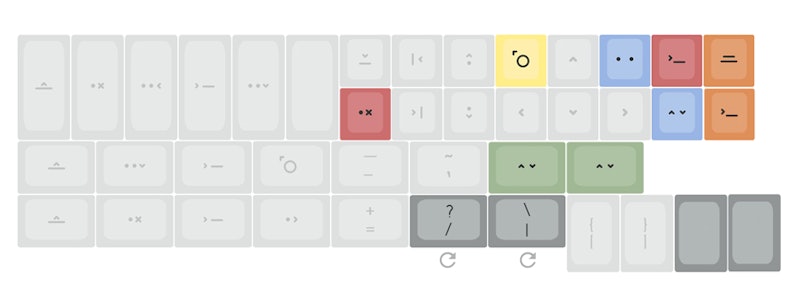
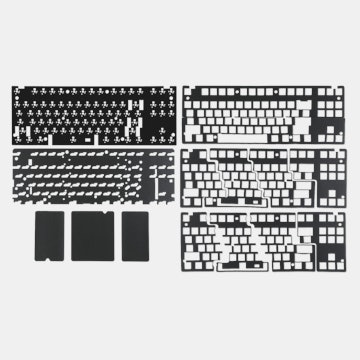
MiToI think something went unnoticed, something is missing in the Betas+Icon modifier kit
In the next image i used "text modifier" only to make it clear but but let's assume that the grey is the icon modifier, those 2 sets are still missing something to be a 104 ansi layout (the basic layout), see image.
Even if you get ICON MODIFIER, you are still missing 6 keys: - 4x 1u keys - 2x 2u keys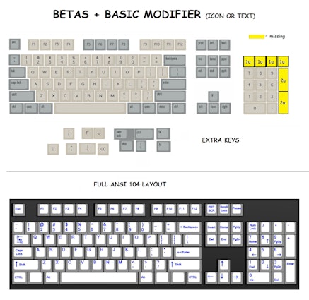
Even if you get ICON MODIFIER, you are still missing 6 keys: - 4x 1u keys - 2x 2u keys
Drop Refurbished
Like-new products you can trustDrop Rewards
Get $5 for every 500 points you earn! Learn more
Drop Keyboard Club
Become a member and expand your keycap collectionCollaborate With Us
For Brands & DesignersFollow Drop
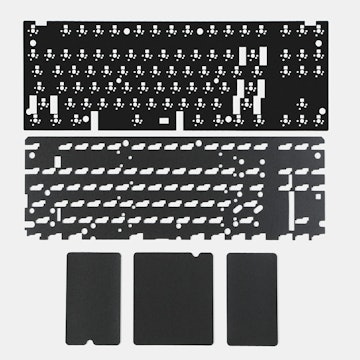
After working on your feedback, here's the kits the received some fixing. I couldn't add or remove everything you asked, but the balanced result can be seen below. Let me know what you think!
* Alphas - reviewed g and j, alignments will be fine tuned even further for the dye sub template: