Click to view our Accessibility Statement or contact us with accessibility-related questions


PRODUCTS YOU MAY LIKE


Trending Posts in Mechanical Keyboards
NewmanDA9901
LOTR Keyboard with Hardcore keycaps?
Hello. Is there a way to get the DROP + THE LORD OF THE RINGS™ BLACK SPEECH KEYBOARD with only the HARDCORE BASE KIT keys? Without the English letters on it. I really want one but it would be awesome if it came with the hardcore kit installed. Thanks in advance!
May 2, 2024


mabyen
Battlestations
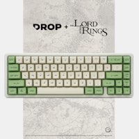
Black Speech keyboard
Looks and feels good and mechanical sound is great!
May 1, 2024

dovenyi
What is SpaceFN and why you should give it a try
The SpaceFN concept - setting up your space key as a layer switch when held - is probably one of the most useful tweaks in the keyboard hobby. Let me explain how it works. My SpaceFN article on kbd.news made some rounds recently - quite surprisingly given the age of this concept. This piece you're reading is a condensed version of the full post. If you're left with unanswered questions, you'll most likely find the info you're looking for in the original write-up. On my imaginary top list of the most useful keyboard features, tweaks and hacks, SpaceFN would deserve a podium finish for sure. But what makes it so special? In short: SpaceFN is easy to implement, easy to learn, costs nothing, can be used with any keyboard, and can improve your productivity instantly. I will list its benefits below, but can state right at this point that the SpaceFN concept, setting up your space key as a layer switch when held, is clearly one of the most useful tweaks in the keyboard hobby....
Apr 30, 2024
Ike4948
Silent Holy Panda X?
I ordered some Holy Panda X switches, and I fell in love with them. They are a joy to type on. There's just one problem. The place that I use my keyboard to type the most is obviously at work, which is a problem if I want to use the Holy Panda X in the office around a whole bunch of people. I really don't want to torture my coworkers with the clack of these switches. I'd rather they still liked me. The good news is that, for me, the actuation of the Holy Panda X is the best part. I could take or leave the sound it makes; even if it is fantastic. Which leads me to my conundrum: is there another "silent" switch that feels similar to the Holy Panda X? Is there a piece I can remove from the Holy Panda X that would allow me to make them silent? Or am I going to have to wait and see if Drop will drop a Silent Holy Panda X for the in-office mech community?
Apr 29, 2024


DaveKaretnyk
Mode Tempo with Red Samurai
Mode Tempo (60%) with GMK Red Samurai & Mode Lotus keycaps
Apr 25, 2024
Drop Refurbished
Like-new products you can trustDrop Rewards
Get $5 for every 500 points you earn! Learn more
Drop Keyboard Club
Become a member and expand your keycap collectionCollaborate With Us
For Brands & DesignersFollow Drop
If you want a parameter, the portrait photo (first picture) displays the colors a little more accurately than the other ones. I have the keycaps on my hands and I can tell that the beige is in reality less creamy and the grey is cooler than what me and the camera managed to capture.
> The $ character; > The % character; > F1 – F12 vertical alignment on the keycaps.
Production seems to be on track and I hope to be able to share more pictures soon. Please keep an eye to the official drop discussion tab and your e-mail inboxes for updates. I’ll keep updating you guys as soon as I have more information, hope you’re excited! You can see pictures at a higher resolution in the link below:
http://mitormk.com
And the equals sign looks slanted.
It just looks like not a very good person was selected to do the dye sub , probably to cut costs and increase profits. Or maybe it was just an oversight. Who knows? This dye sub reminds me of those caller id's from the 90's for blind people with the huge weighty font.
I wouldn't be so pissed if the price wasn't so ridiculous. $70 shipped for a 60% board is absurd, especially when you expect one thing and get something else. Sorry Mito, but you dropped the ball on the dye sub.
The legends have the thickness you see for a reason, it's a geometric proportion I conceived to create balance between keycap surface area, ink bleed and readability, and it was like that since day one. There wasn't any "cost saving to increase profits techniques" or any other flaw. Renders arent 100% accurate and will never be.
Your opinion is more than welcome, so feel free to criticize. Hopefully I can make something you enjoy one day. Also, if you don't like the keycaps once you receive them you can contact support and return the keycaps.
I don't buy it. The only logical answer is that the manufacturer's process printed them too thick. What you're insinuating is that you designed them from the beginning to be printed that thick, but yet, somehow, the renders came out to thin. Yea, not buying it.
> Renders arent 100% accurate and will never be.
You're missing the point dude. The point is that the renders show what you WANTED it to look like. That's what WE wanted it to look like. And now your manufacturer is giving you something else. That's not an insignificant thing.
> Your opinion is more than welcome, so feel free to criticize.
I think you're already starting to see a consensus here if you look at the comments and endorsements. Nobody wants a thick bolded font. it looks like crap, it's not what we paid for. If there's still time to fix this, then please do.
> Hopefully I can make something you enjoy one day.
As far as your previous group buys go, PuLSE was great, but let's not forget all the drama and backpedaling that went on there.
> Also, if you don't like the keycaps once you receive them you can contact support and return the keycaps.
If the font is as thick as the provided pictures, then yes, I am going to return these for a full refund. What you're showing now is not what was advertised.
I just don't get how you throw up these renders knowing all along the font is going to be substantially heavier than what is shown. Why not at the very least mention it in the drop description that the fonts will be heavier? It just doesn't add up to me.
Hope something can be done at this late in the stage
Wake up. I do agree the lines are far thicker and that may look bad to some; I have talked to my personal group of friends who purchased the set and they all like the samples Mito received. Granted there's only like 5 or 6 of us but considering that's how many you guys are then maybe that's not so bad you know? /s
What I'm saying is that I ordered some "bauhaus inspired" key caps and those look pretty "bauhaus inspired" to me.