Click to view our Accessibility Statement or contact us with accessibility-related questions


Showing 1 of 2438 conversations about:

SifakaMon
310
Sep 16, 2017
bookmark_border
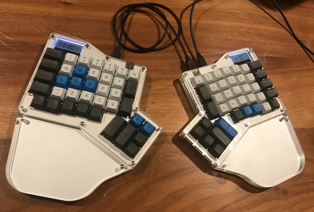
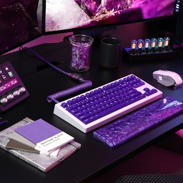
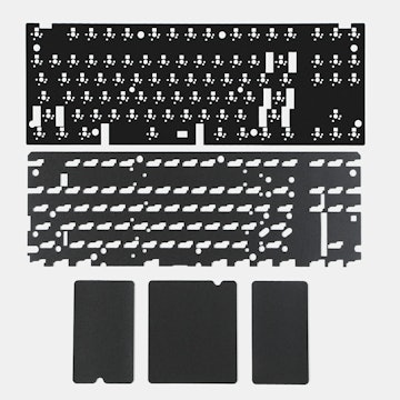
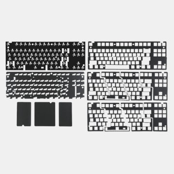
Ergodox number 4 is assembled. Kaihua bronze tactile switches, keyset is DSA HC Granite ergodox set with normal Granite body from Signature Plastics.
SifakaMon
310
Sep 17, 2017
bookmark_border
SifakaMonAdding a little DAIM <www.daim.org> and some x-acto knife work on some textured paper and it looks even cooler. Love how the image on the bottom of the acrylic hand rests make it look 3D

SifakaMon
310
Sep 19, 2017
bookmark_border
sup4mnI put B, Y, and H on the 1.5U high keys. Gives me enough space on right side for most punctuation in qwerty, and the lower row on he left I can't get away from the stagger that qwerty keyboard usually have so I just moved stuff to the right and inserted tilde.
SifakaMon
310
Sep 19, 2017
bookmark_border
sup4mnI constantly move back and forth to laptop keyboards but I find this ergodox layout works for me, only delete and cursors move enough notice the difference and in each case they are different enough that they don't get hit accidentally on either one. no one is going to make 1.5U high B, H and Y though, sadly.
SifakaMon
310
Sep 25, 2017
bookmark_border
SifakaMon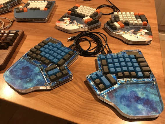
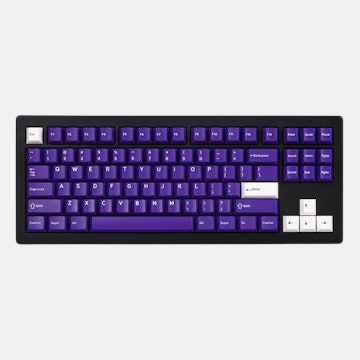
Ergodox number 5 is ocean blue with super light 42g Zelios and PMK's DSA profile dye-sublimated PBK caps to match. Achohol inks directly applied to the second plastic layer for the top, ink on plasticised paper on the hand rests. Key switches so light the terrible stabilizers IC sourced just get stuck, so removed them. In the background note the DAIM board got hit with some SA Carbon Ergodox blank modifier goodness mixed with the body keys from Nantucket Selectric while that board is being redone.
Ergodox number 5 is ocean blue with super light 42g Zelios and PMK's DSA profile dye-sublimated PBK caps to match. Achohol inks directly applied to the second plastic layer for the top, ink on plasticised paper on the hand rests. Key switches so light the terrible stabilizers IC sourced just get stuck, so removed them. In the background note the DAIM board got hit with some SA Carbon Ergodox blank modifier goodness mixed with the body keys from Nantucket Selectric while that board is being redone.
DirkShatner
103
Sep 25, 2017
bookmark_border
SifakaMonWhat are the PBT color codes you ended up with for the blue and gray if you don't mind me asking? My plan is to go this route and try to get a close match to the ABS Pulse themes as much as is possible. (Really wish that SP would offer the same type of product in ABS so that I could use that astounding color combo.)
SifakaMon
310
Sep 25, 2017
bookmark_border
DirkShatnerThe blue is BCT which is the same color as the blue accent colors in DSA Granite, and the grey is GQT, which is the color of DSA Granite HC modifiers. Yup color codes are different between the types of plastic. I think this GQT looks very, very similar to the grey in SA Carbon (which I'm pretty sure is ABS plastic) for what it's worth. I have no similar blues.
Related Products
Drop Refurbished
Like-new products you can trustDrop Rewards
Get $5 for every 500 points you earn! Learn more
Drop Keyboard Club
Become a member and expand your keycap collectionCollaborate With Us
For Brands & DesignersFollow Drop