Click to view our Accessibility Statement or contact us with accessibility-related questions


Showing 1 of 285 conversations about:

Adrien
35
Oct 26, 2015
bookmark_border
Can we get some feedback and more customer photos from the previous drop?
IKEAdragon
6
Oct 27, 2015
bookmark_border
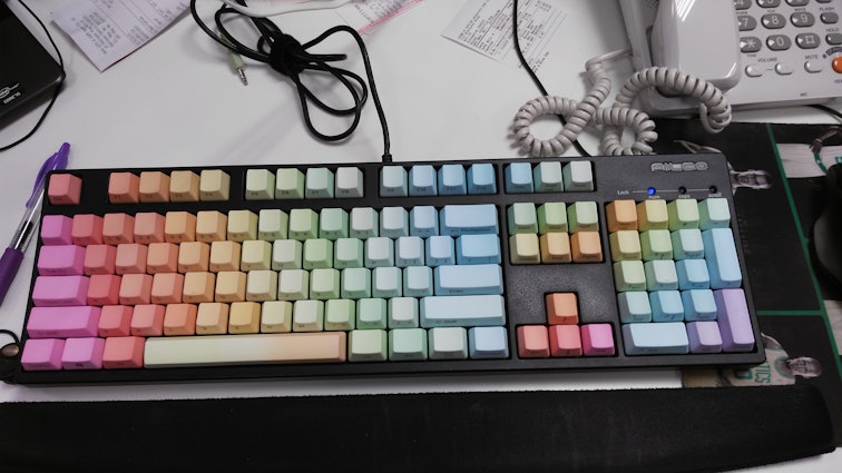
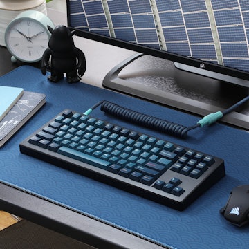
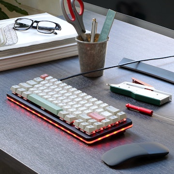
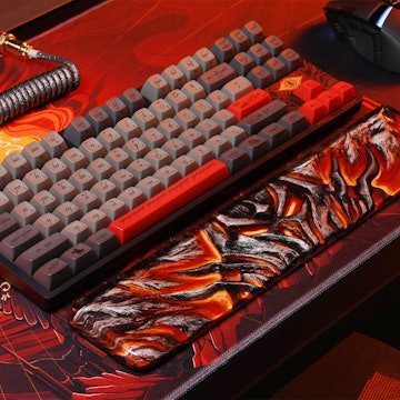
AdrienYeah I've just set them up on my Filco and my, they are majestic as f to look at ;)
I'm one of those who have no qualms about sanding the edge for my costar stabilisers to clear, and all had to be sanded except my right Shift key; some more, some less.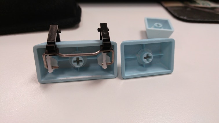
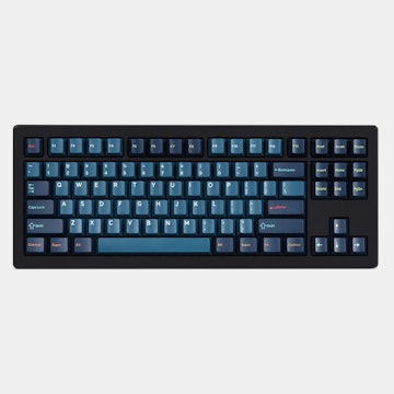
The set came in the blue flat piece of plastic MD uses to display keycaps, which were a pain to get the keys out of (I think I actually like keys in plastic baggies :X) but were pretty well packed. There weren't any obvious colouring defects that I noticed and I like the font much more than Keycool's. The legends are fully etched and more grey than black (not sure if photos show it).
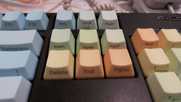
The only thing I have an issue with is the inconsistent font size everywhere, the most obvious is the home row (specifically, [insert home pgup] is small, same size as [prtsc scroll lock pause numlock]. these are smaller than [delete end pgdn], which are the same size as the other large keys [backspace enter shift control]).
I'm one of those who have no qualms about sanding the edge for my costar stabilisers to clear, and all had to be sanded except my right Shift key; some more, some less.
The set came in the blue flat piece of plastic MD uses to display keycaps, which were a pain to get the keys out of (I think I actually like keys in plastic baggies :X) but were pretty well packed. There weren't any obvious colouring defects that I noticed and I like the font much more than Keycool's. The legends are fully etched and more grey than black (not sure if photos show it).
The only thing I have an issue with is the inconsistent font size everywhere, the most obvious is the home row (specifically, [insert home pgup] is small, same size as [prtsc scroll lock pause numlock]. these are smaller than [delete end pgdn], which are the same size as the other large keys [backspace enter shift control]).
Dr_DD
7
Oct 27, 2015
bookmark_border
IKEAdragonHow much material did you have to remove/sand would you say? It doesn't look like too much in the picture you posted.
Adrien
35
Oct 27, 2015
bookmark_border
IKEAdragonBeautiful keyboard + keycaps, despite font size difference. The front-print makes them look even better. Enjoy!
Just one more thing: how's the texture/sandiness on these puppies?
Just one more thing: how's the texture/sandiness on these puppies?
IKEAdragon
6
Oct 29, 2015
bookmark_border
Dr_DDLess than half an mm I believe; just shaved off a bit at the edge. It also depends on how much clearance you want to give the stabilisers too..I was lazy and I just sanded mine with a nail file :|
IKEAdragon
6
Oct 30, 2015
bookmark_border
AdrienThanks haha. Yeah well, I've just tried to no avail to get a close up of the texture of my keycaps. It feels really good, comparable to vortex's PBTs; it's definitely more on the textured side than the smooth side yep, hope it helps! Glad you're a participant of this drop too haha
Related Products
Drop Refurbished
Like-new products you can trustDrop Rewards
Get $5 for every 500 points you earn! Learn more
Drop Keyboard Club
Become a member and expand your keycap collectionCollaborate With Us
For Brands & DesignersFollow Drop